When It Wasn't Dalnavert

http://www.mhs.mb.ca/docs/sites/dalnavert.shtml

Dalnavert as a boarding house in 1959.

Before 61 Carlton Street became Dalnavert Museum, it spent nearly forty years as a rooming house. According to a 2012 interview with Gabriel Boucher, who spent ages 9-17 living at 61 Carlton part time, his grandparents Eugene and Olivine Rouillard bought the house in 1939. That was ten years after the home’s last remaining occupant, Lady Agnes Macdonald, had moved out. Boucher believed that his grandparents bought it from the Macdonald estate, though according to a tour guide manual from 2000, “[t]he estate sold the house to the Royal Trust Company”. Boucher described it as a ‘dump’, which cost twice as much to renovate as it did to buy. Little is known about the house during the period before it was sold. It may have sat empty, or it may even have been for sale all that time. Things may have moved slowly due to Lady Macdonald’s health. We know that at one time, the parlour was operated as a dance hall. According to one story, a real estate agent once attempted to cheat a demolitions company by selling them the property, only for them to realize that he had no right to do so!

61 Carlton’s time as a rooming house has been explored by historians less than its time as an affluent family’s home. This neglects the experience of the people who lived there during that period, a group which makes up the bulk of those who have ever called the house home. In this respect, the rooming house residents have something in common with the servants of the Macdonald’s period. While on the surface a testament to the lives of the rich and privileged, the house has far more history housing far less wealthy people.

That said, there remain some records from the rooming period, including newspapers, documents from the building restoration in the 1970s, and Boucher’s testimony.  For example, Boucher recalls that his grandparents thought the house may have been “of ill-repute” when they bought it, but during the rooming house period, its reputation seems to have recovered. While the Historical Buildings Committee refers to 61 Carlton as “a boarding house for fashionable women”, Boucher remembers a more eclectic demographic, though he confirms that most were women. Surviving newspaper advertisements reference a man offering piano lessons from the home, and the Imperial Order Daughters of the Empire held meetings from the house. This would have been considered respectable and reflects the house’s then standing.  

Regardless, the home’s subsection into approximately 17 units speaks to a steep decline in status since its days as Dalnavert. Before the Rouillards bought the house, there were already rumors of demolition. Subdivision was not an uncommon fate for big houses at that time. According to a 1980 report by the Historical Buildings Committee, “many of the [area’s] handsome structures were themselves divided and their rooms rented”.

At the time of 61 Carlton’s opening as a rooming house it was commonplace to board, stay in residential hotels, and rent rooms. Large houses like Dalnavert, which may have struggled to maintain themselves through the economic downturn of the Great Depression, were often subdivided and rented to as many people as they could fit. An average family home might rent out a room; Dalnavert rented well over a dozen. The original five bedroom layout must have been unrecognizable. Where there had once been four family members and two staff members, there would have been 20-something inhabitants. Some of these residents would have shared suits, like the Rouillards and a pair of sisters Boucher remembered sharing the dining room. Notably, the larder, then (and now) an extremely narrow walk-in storage space, was a woman’s bedroom. According to Boucher, it could fit only a bed and a dresser. On the first floor, the pantry had been turned into a bathroom, and the solarium into a kitchen. These modifications were necessary in order to service the influx of residents. Other changes were less practical. For example, many visitors marvel at Dalnavert’s heavy darkness. This is, for the most part, due to the dark wood omnipresent in the home. As a rooming house, every inch of this wood was painted white! This paint job was one of the fourteen layers which were removed during the 1970s restoration.

In the decades following the closure of the Rouillard’s rooming house, the economy re-stabilized, allowing many to move out of rooming houses and into more comfortable accommodations. Those who didn’t were often forced out by increasingly prohibitive bylaws, which decreased the availability of affordable shelter. Rooming houses deteriorated and closed. While this may not have been 61 Carlton’s fate, by then handed down from the Rouillards to their daughter, its closure fits the timeline of this decline.

 82 years ago, 61 Carlton opened its doors as a rooming house, spending 40 years in that incarnation. Notably, its current incarnation as a museum has run five years longer than that, discounting a two year detour from 2013-2015. The house’s history continues to build upon itself. Today, it is open to the public, inviting people to come, experience the house, and add themselves to its story.

Works Cited

61 Carlton Street “Dalnavert”: Sir Hugh John MacDonald House. Manitoba Historical Society. May 14, 1980. https://www.winnipeg.ca/ppd/Documents/Heritage/ListHistoricalResources/Carlton61-long.pdf.

Boucher, Gabriel. Interview With Gabriel Boucher, Son of Marie Berthe Noella Rouillard, Grandson of Eugene and Olivine Rouillard, Who Owned 61 Carlton From 1940 to 1959/60. By Jenny Bisch & Mary Steinhoff. 2012.

Giles Bugailiskis in discussion with author, June 2021.

Historic Sites of Manitoba: MacDonald House/ Dalnavert Museum (61 Carlton Street Winnipeg). Manitoba Historical Society. May 17, 2020. http://www.mhs.mb.ca/docs/sites/dalnavert.shtml.

Student Housing, Boarders and Rooming Houses. August 6, 2015. https://winnipeg.ca/ppd/pdf_files/Brochures/Student-Housing-Boarders-and-Rooming-Houses.pdf.
 

Dalnavert, in Yellow

Yellow is one of the three primary colours and is among the oldest colours used by humans to create art. Along with red (ochre), yellow is present in cave paintings from the Paleolithic era. During the Neolithic era, humans began to dye objects, with yellow being among the first pigments used as a dye. In the 19th century yellow had a bit of a questionable reputation. A genre of books called Yellow-back books, which were sold in railway stations, would have yellow covers to attract the eye. Some had a moral objection to the books as they were sensational tales that didn’t have much meaning beyond being entertaining. In the novel The Picture of Dorian Gray, the titular character has a collection of these books, which is author Oscar Wilde’s commentary on people overindulging and putting too much thought into the sensational stories. There was a publication called ‘The Yellow Book’ which was illustrated by artist Aubrey Beardsley. When Oscar Wilde was arrested for ‘gross indecency’ he was rumoured to have had a copy of ‘The Yellow Book’, however it was just a French novel. Yet, the rumour stuck. Yellow-back books represented sin for some, but the sunshine of modernity through aesthetics for others; yellow became a symbol of the rejection of Victorian morals and ethics.

Yellow has been a popular colour amongst artists. Notably, artists from the 19th century frequently used yellow in their paintings. Vincent van Gogh used yellow frequently, including for the stars in his famous The Starry Night (1889). The Aestheticism movement was on the rise in the 19th century, which celebrated art for the sake of art. Aestheticism rejected the idea that art needed a moral or ethical story, which was a norm in Victorian artworks. A beautiful home with beautiful objects was on the rise of the Aesthetic movement. Yellow was such a part of this that some referred to the 1890s as the ‘Yellow Nineties’, representing the step away from the conformity typically found in Victorian art and culture. From cave paintings, to mysterious origins, to home décor, to rebellious and radical, the colour yellow isn’t just a sunshine-happy colour.

 Lead-tin yellow

            Lead-tin yellow, also known as massicot in Northern Europe or giallorino in Italy, as the name suggests, is the combination of lead and tin. This shade was commonly used in Europe and was at the height of its popularity in the 15th, 16th and 17th centuries. Its use lessened in the 18th century and it was not used after 1750. It is a pale-yellow colour and was used in many famous artworks, including those of Leonardo da Vinci, Johannes Vermeer and Peter Paul Rubens

Before being mixed as a paint, it was used as a ceramic glaze. It use as a glaze goes back before 1300. It was also utilised in glass manufacturing, specifically in Italy. Although the colour was very popular in its time, it was quite mysterious when it went out of use in the 1750s. It was then ‘rediscovered’ in 1941 by Richard Jacobi.

The Honeysuckle Bower (c. 1609) Peter Paul Rubens. Source: https://www.wikiart.org/en/peter-paul-rubens/the-honeysuckle-bower-1609

The Honeysuckle Bower (c. 1609) Peter Paul Rubens. Source: https://www.wikiart.org/en/peter-paul-rubens/the-honeysuckle-bower-1609

The Milkmaid (1657-58) Johannes Vermeer. Source: https://www.rijksmuseum.nl/en/rijksstudio/artists/johannes-vermeer

The Milkmaid (1657-58) Johannes Vermeer. Source: https://www.rijksmuseum.nl/en/rijksstudio/artists/johannes-vermeer

Indian Yellow

            Though it has had many names throughout the centuries, the shade Indian Yellow was likely introduced to the people of India by the Persians in the 15th century. In the early days of use, it was utilised for watercolour and tempera paints, and sometimes employed as a glaze for ceramics. Produced using cow urine, unsurprisingly, it was rather smelly.  Indian yellow was heavily employed in artworks in India during the late 16th to 19th centuries in the Mughal period, including in the illustrated version of the poem Gita Govinda (c. 1790). In the 19th century there were acts in India prohibiting the manufacturing of the pigment on grounds of cruelty to animals.


In Europe, there is some evidence of English painters creating art using the pigment in the 18th century, however it is much better documented in the 19th century. Victorians were very curious about the pigment, but little was known about it. In the 1880s the director of Kew Gardens, Sir Joseph Hooker, was so pressed about the origins of Indian yellow that he began to make inquiries about the pigment. Artist JMW Turner favoured the colour so much that some called it Turner Yellow. It features in his painting The Angel Standing in the Sun (1846). Since the colour was so brilliant and long lasting, it was favoured by many artists. Another striking example of India yellow is in the above-mentioned Vincent van Gogh’s The Starry Night (1889).

The Angel Standing in the Sun (1846) JMW Turner. Source: https://www.tate.org.uk/art/artworks/turner-the-angel-standing-in-the-sun-n00550

The Angel Standing in the Sun (1846) JMW Turner. Source: https://www.tate.org.uk/art/artworks/turner-the-angel-standing-in-the-sun-n00550

Gamboge

Gamboge is a transparent yellow pigment produce from the trees of the genus Garcinia, located in south and southeast Asia but mostly harvested in Cambodia. The yellow-orange pigment comes from the resin collected from the trees. Collecting the resin from the trees, or milking the trees, is a timely process which takes years. The earliest evidence of the pigment in use is in the 8th century CE in east Asia, specifically Japan. It has been popular and continues to be used into the modern era. Specifically in the 19th century Japan, it is noted in the artwork An Oiran Standing by a Plum Tree (mid-19th century) by Utagawa Kuniyuki.

An Oiran Standing by a Plum Tree (mid-19th century) Utagawa Kuniyuki. Source: https://artsandculture.google.com/asset/an-oiran-standing-by-a-plum-tree-artist-kuniyuki-utagawa/oAFcxaYk_TCaWQ?hl=en

An Oiran Standing by a Plum Tree (mid-19th century) Utagawa Kuniyuki. Source: https://artsandculture.google.com/asset/an-oiran-standing-by-a-plum-tree-artist-kuniyuki-utagawa/oAFcxaYk_TCaWQ?hl=en

            Gamboge made its way to Europe in the 17th century when the East India Trading Company imported it to England in 1615.  Although, it may have been used in illuminated manuscripts in the centuries before. In the 18th century it began to be imported to North America, as well as around the world. It is typically used as a watercolour pigment but when it was imported to Europe, Flemish artists use it in oil paints. Rembrandt used it, and it was present in his painting Saskia van Uylenburgh As Flora (1641). It was also utilised as a varnish for decorative art items and as a varnish on metals in the 19th century. As it is transparent, its brilliance depends on the layering of the pigment.


Saskia van Uylenburgh As Flora (1641) Rembrandt van Rijn. Source: https://colourlex.com/project/rembrandt-saskia-with-a-flower/

Saskia van Uylenburgh As Flora (1641) Rembrandt van Rijn. Source: https://colourlex.com/project/rembrandt-saskia-with-a-flower/

Since being imported by the East Indian Trading Company, gamboge was a staple to many European artists palettes. In the 19th century it was used by yellow enthusiast, JMW Turner. It was mixed with Prussian blue to create Hooker’s green, which was a favourite for painting foliage. It was eventually replaced by aureolin.

The Burning of the Houses of Parliament (1834-5) JMW Turner. Source: https://www.artisoo.com/OilPaintingBlog/the-burning-of-the-houses-of-parliament-by-turner/

The Burning of the Houses of Parliament (1834-5) JMW Turner. Source: https://www.artisoo.com/OilPaintingBlog/the-burning-of-the-houses-of-parliament-by-turner/

Orpiment and Yellow Gold

Some of the objects in Dalnavert’s collection are a shade of yellow gold. Gold has been heavily used in art throughout space and time. Gold has been seen as a divine symbol, as well as a symbol of wealth and prosperity. It has been highly coveted since ancient times, something that you could say of the Victorians but also of us today. In the Byzantine Empire and Medieval art, gold was used to represent the divine and spiritual spaces. It was used as a background to symbolise that the figure was in a heavenly, not earthly space. Often gold is gilded onto other metals or surfaces as having a statue or object of pure gold would be quite costly. Another solution was to use paint the resembled gold, such as orpiment. Orpiment was a highly toxic mineral derived from arsenic that comes from volcanic rock. If heated, it turned from a yellowish colour to more of a yellow-orange. The more heat, the more orange. Orpiment was the pigment used in the striking Victorian painting Flaming June (1895) by Frederic Leighton. Leighton was one of the founders of the Aesthetic movement in the 19th century.


Flaming June (1895) Frederic Leighton. Source: https://www.bbc.com/culture/article/20180227-the-toxic-colour-that-comes-from-volcanoes.

Flaming June (1895) Frederic Leighton. Source: https://www.bbc.com/culture/article/20180227-the-toxic-colour-that-comes-from-volcanoes.

However, if an image was being produced for royalty or of a divine figure, the artwork would contain gold leaf. The practice of using gold leaf was carried on throughout the centuries, and perhaps one of the most famous Edwardian examples of the use of the material is in the images by Gustav Klimt. His Portrait of Adele Bloch-Bauer I (1907) and The Kiss (1908-09) heavily use gold leaf to highlight figures.


The Kiss (1908-09) Gustav Klimt. Source: https://artuk.org/discover/stories/colour-in-art-a-brief-history-of-gold.

The Kiss (1908-09) Gustav Klimt. Source: https://artuk.org/discover/stories/colour-in-art-a-brief-history-of-gold.

Cadmium Yellow

 Early 19th century artists began to use a recent discovery, cadmium yellow. Cadmium yellow could be chemically altered to produce a variety of yellows and oranges, therefore ‘cadmium yellow’ typically refers to a range of colours. It was discovered in 1817 by Friedrich Stromeyer, who recommended artists use the pigment in their palettes. The pigment was used by Vincent van Gogh, Henri Matisse, Piet Mondrian, Claude Monet and it appeared in the iconic The Scream (1893) by Edvard Munch.

The Scream (1893) Edvard Munch. Source: https://www.nasjonalmuseet.no/en/collection/object/NG.M.00939.

The Scream (1893) Edvard Munch. Source: https://www.nasjonalmuseet.no/en/collection/object/NG.M.00939.

 As highlighted by The Scream, many of these artists were stepping away from traditional Victorian art, painting in a more abstract, expressive and, in some cases, surreal fashion. Munch’s The Scream or the abstract cityscapes of Mondrian were dramatically different than the moral stories old fashioned Victorian’s saw in their art. The colour yellow represented the new appreciation for modernity and beauty, which is how the colour yellow is seen in Dalnavert’s objects. The colour yellow has gone from being one of the first pigments, to a pigment used in the artworks stepping away from Victorian traditions.

Dalnavert, in Colour: Yellow.

Dalnavert, in Colour: Yellow.

This is part of a series of blog posts related to our Dalnavert, in Cololur exhibit. Look out for posts on more colours!


Bibliography

Feller, Robert L. Artists’ Pigments: A Handbook of Their History and Characteristics, Vol.I. Washington: National Gallery of Art, 1986.


Fitzhugh, Elizabeth West (ed.). Artists’ Pigments: A Handbook of Their History and Characteristics, Vol. III. Washington: National Gallery of Art, 1997.


Grovier, Kelly. “The murky history of the colour yellow.” BBC Culture. 06/09/2018 [retrieved 19/02/2021]. https://www.bbc.com/culture/article/20180906-did-animal-cruelty-create-indian-yellow.


Hulsey, John and Ann Trusty. “Turner’s Mysterious Yellow.” Artist Network. N/D [retrieved 19/02/2021]. https://www.artistsnetwork.com/art-subjects/plein-air/turners-mysterious-yellow/.


Mellor, Maria. “A Brief History of the Colour Yellow.” Arts & Collections. N/D [retrieved 19/02/2021]. https://www.artsandcollections.com/article/a-history-of-the-colour-yellow/.


Roy, Ashok. Artists’ Pigments: A Handbook of Their History and Characteristics, Vol. II. Washington: National Gallery of Art, 1993.


St Clair, Kassia. The Secret Lives of Colour. London: John Murray, 2016.


Winsor & Newton. “Spotlight on cadmium yellow.” Winsor & Newton. N/D [retrieved 19/02/2021]. https://www.winsornewton.com/na/articles/colours/spotlight-on-cadmium-yellow/.


Dalnavert, in Pink

Dr. Kyle McPhail, Intern Curator

Today many people see the colour pink as a ‘girly’ colour, but in fact that is a 20th centrury concept. In the Victorian era it was a little different. In 1893 the New York Times suggested boys should always wear pink. This was because pink was a stronger colour, as it is closer to red. The word pink to describe a pale red didn’t come into use until the late 17th century. As a result, most of the history of pink is modern and in fact from the 20th century.

            Pink pigments have had their place in history. The colour pink was all the rage in the Rococo era; pink pigments were used in painting the flesh of nude women from around this time forward, therefore there is an association with the over-sexualization of women associated with the colour. It was in the 19th century that the colour pink disappeared from menswear. Before this, it was perfectly acceptable and rather fashionable for men to wear shades of pink, as evident in Thomas Gainsborough’s Francis Nicholls “The Pink Boy” (1782).  In the 19th century men began to wear somber colours, like blacks and greys. The change in attitude towards colour has to do with the now heighted ideas of gender difference. Colour, including pink, was seen as feminine, while dark somber colours were masculine. However, pink is possibly the colour that is most policed when it comes to gender roles. The colour pink symbolises that thoughts on or associations with a certain pigment can influence the interpretation of wearer or object. Shades of pink can be seen as a colour of activism and have been used in various forms of protest art, such as The Guerilla Girls and ACT UP.

pink boy.png

Francis Nicholls “The Pink Boy” (1782) Thomas Gainsborough. Source: https://www.artuk.org/discover/artworks/the-pink-boy-229417.

Pink is a colour full of contradictions: it is both sophisticated and kitsch, erotic and childlike. From flowers, to royalty and mistresses, to being disreputable and then to protest, the colour pink is a strong colour full of political meaning.

Pastel Pink and Rose Pompadour

It was in the Renaissance that pink began to appear on the artists palette. Then in the 18th century Rococo era pastel pink became very fashionable in interiors and art. It was very popular in salons and bedrooms, often framed with golds and whites. The painting The Swing (1767) by Jean-Honoré Fragonard highlights Rococo’s use of pastel pink, with the young women central in the painting sporting a beautiful pink dress. Many paintings by François Boucher feature pastel pink. Many of Boucher’s paintings also featured nude women. Boucher always painted flesh with pink undertones, perhaps fueling pinks associated with eroticism. Rosalba Carriera’s A Young Lady with a Parrot (1675-1757) features flashes of pastel pink against the pastel blue dress of the main figure. The parrot the woman is holding cheekily opens the boddice of the young lady’s dress, exposing her skin which also incorporates a flesh tone with pink mixed in.

A Young Lady with a Parrot (1675-1757) Rosalba Carriera. Source: https://wsimag.com/art-institute-of-chicago/artworks/108011.

A Young Lady with a Parrot (1675-1757) Rosalba Carriera. Source: https://wsimag.com/art-institute-of-chicago/artworks/108011.

It was in the 18th century that the colour Rose Pompadour, or Pompadour pink, was invented. This pigment has origins in South America from the brazilwood family of plants. At the time, pink was considered a royal colour, its popularity was owed in part to Madame du Pompadour. The Madame du Pompadour, the mistress of King Louis XV, loved pink so much that porcelain manufacturer Sèvres named the newly invented ground pink pigment after her in 1757. The chemist working for the Sèvres, Jean Hellot, discovered multiple shades that defined the Rococo era. Pink is also often associated with the Madame du Pompadour from her portrait by François Boucher in 1758. Pompadour pink had a revival at the turn of the 20th century, along with other light pinks.

Madame de Pompadour (1758) François Boucher.

Madame de Pompadour (1758) François Boucher.

Fuchsia and Magenta

The history of pink is tied to the histories and study of plants. Many shades of pink are named after flowers, in fact in many languages the word for ‘pink’ is derived from the word for rose. The English word for pink comes from the flower of the same name, which came into use to refer to the colour in the 17th and 18th centuries. Referring to colours as rose dates back to the Middle Ages. Some flower named shades of pink include cherry blossom pink, carnation pink, amaranth pink, rose and fuchsia. The colour cherry blossom pink was very popular and important in Japan. Interestingly, the Japanese word for pink (momo) has been in use since 750 CE. During the 19th century Japanisme, a period of great inspiration from Japanese aesthetics, cherry blossom pink made its way into Impressionist paintings.

The study of plants dates back to ancient Greece, but it wasn’t until the 16th century that significant study and publications on the field were conducted. In 1542 Leonhard Fuchs published one of the first thorough books on plants. Although the flower Fuchsia was named after him, it wasn’t discovered until 1703 in the Caribbean. Much later, during the 1960’s and the rise of pop art, fuchsia really came into its element.

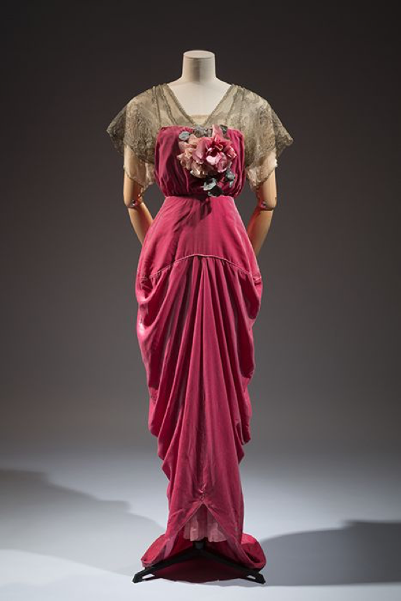
            With the Industrial Revolution the production of cheap and accessible pink pigments was on the rise. This was the time when pink went from the sophisticated paintings of Rococo’s pastel pinks to a more loud and garish pink, for example magenta. Magenta was made in 1859 by the French chemist François-Emmanuel Verguin, and it is a mixture between purple and red, sometimes its referred to as a purplish-red or a reddish-purple. Is it red, is it purple or is it pink? Nonetheless, with the invention of synthetically and mass-produced pinks, bright colourful clothes were more popular than ever. Despite this, many Victorian women saw these loud pinks as vulgar. Some saw pink as an erotic colour: the reddish tones and its association with flesh (perhaps due to the trend of pink flesh started by Boucher) did not help pink generate a pure reputation. Additionally, pink was used for many pieces of 19th century lingerie. It wasn’t until French couturier Paul Poiret in the early 20th century did the colour pink switch back to a sophisticated shade. Poiret designed sophisticated outfits with featured loud and deep shades of pink, including this evening gown from c.1912-14.

Evening Gown, 1912-1914, Paul Poiret. Source: https://exhibitions.fitnyc.edu/pink/#grid-page. 

Evening Gown, 1912-1914, Paul Poiret. Source: https://exhibitions.fitnyc.edu/pink/#grid-page

Poiret’s usage of a deep pink rather than a pastel pink was very different than Victorian fashion. In the Edwardian and into the 1920’s Art Deco fashion,  the colour pink was a prominent trend.

Political pink and Millennial pink

Pink has had a lot of political meanings throughout the centuries. After ending the 18th and 19th centuries with associations with flesh and lingerie, the 20th century saw a political turn for the colour pink. It was at this time that deeper and more shocking shades of pink, like fuchsia and magenta, gained in popularity. In the 20th century, the colour pink begins to be thought of as a political colour, although plenty of people continue to see it as frivolous. There is an association with pretty, soft and feminine. In the 1980s, however, the pink triangle was reappropriated and used in many AIDS activist artworks, being heavily featured in the works of Keith Haring, Act Up and General Idea. For the queer community, the pink triangle that went from a symbol of hate from the Nazi era that was appropriated into the symbol of resilience and survival.

In 2017 the pink ‘pussy’ hats worn during Women’s Marches across the world shows that once again, pink is a colour of resilience and protest. However, some were critical of the use of the colour pink, thinking that protesters wearing the colour wouldn’t be taken seriously. This shows that the social construction of the colour as feminine and frivolous is still alive in the 21st century. These outdated ideas are slowly changing in the mainstream. Also in 2017, the shade called Millennial pink brought the colour pink back to its gender-neutral roots; the timeless light pink shade became all the rage for people of any gender, which was included in designs by icon Rihanna.

Similarly, the shades of pink in Dalnavert reflect the trends of the 19th century but without the politics. Many of the pink objects in Dalnavert’s collection are in the form of cranberry glass. The colour is a cranberry-like rose pink, which is a result of adding gold chloride to the glass. The more gold-chloride present, the deeper the colour. It is believed that cranberry glass was first made in the Roman Empire, however, it was most famously produced in the Victorian era, when glass-blowers refined and improved the manufacturing of cranberry glass. Therefore, like Rihanna, the use of pink in Dalnavert reflects the trends of the time. The colour pink, no matter what one thinks of it, plays an important role in the histories of art, politics, protest, fashion and décor.

Dalnavert, in Colour: Pink.

 This is part of a series of blog posts related to our Dalnavert, in Colour exhibit. Look out for posts on more colours!

Bibliography

Bucknell, Alice. ‘A Brief History of the Color Pink.’ Artsy. 06/11/2017 [retrieved 03/03/2021]. https://www.artsy.net/article/artsy-editorial-history-pink.

Cerini, Marianna. ‘Refined, rebellious and not just for girls: A cultural history of pink.’ CNN. 31/10/2018 [retrieved 03/03/2021]. https://www.cnn.com/style/article/history-of-color-pink/index.html.

Materials and their Makers. ‘Rose Pompadour.’ Materials and their Makers. N/D [retrieved 03/03/2021]. https://bt.barnard.edu/ave2015/project2/eighteenth-century-colors/rosepompadour/.

Museum at the FIT.’ Pink: The History of a Punk, Pretty and Powerful Color.’ Museum at the FIT. N/D [retrieved 03/03/2021]. ‘https://exhibitions.fitnyc.edu/pink/?url=the-feminization-of-color%2Ffeminzation-P92.40.1-1.

Steele, Valerie. Pink: The History of a Punk, Pretty, Powerful Color. London: Thames & Hudson, 2018.

St Clair, Kassia. The Secret Lives of Colour. London: John Murray, 2016.

Wiggins, Pamela. ‘Collect a Crop of Cranberry Glass’. The Spruce Crafts. 15/01/2019 [retrieved 18/02/2021]. https://www.thesprucecrafts.com/collecting-cranberry-glass-147996.

Dalnavert, in Blue

Dr. Kyle McPhail, Intern Curator

The colour blue has a very complex history with origins in Afghanistan, journeying down the Silk Road to Renaissance Venice and eventually ending up being manufactured in the laboratories of Germany. In the classical period, for the Romans the colour was a symbol of misfortune, mostly due to Celtic soldiers wearing blue body paint. Later to people in the Middle Ages, it was considered divine and associated with the Virgin Mary, with most images of Mary depicting her wearing blue robes. In the 12th century blue was embraced by royalty and became the royal colours of France. This association with royalty, and the Virgin Mary, made the colour blue’s popularity increase over the centuries. During the Industrial Revolution it was a symbol of the improvements of pigment manufacturing. The discovery of synthetic blue pigments made it accessible and among the most popular colours used by artists. From religion, to royalty, to industry and then to art, let’s take a closer look at blue.  

Lapis lazuli and ultramarine blue

The key to most blue pigments is lapis lazuli. This semi-precious and complex rock was mined in parts of Afghanistan as early as the 7th century BCE. For most of the colour blue’s history, this was the only place people mined for lapis lazuli. It was very expensive; in fact, it was similar in price to gold. Additionally, there is evidence and artworks from Ancient Mesopotamia and Ancient Egypt that show the use of lapis lazuli, however they did not grind it to make a pigment. Due to its composition, when they would attempt to grind it, the colour would end up being grey rather than a brilliant blue.

In the 6th century CE people figured out how to properly utilise the pigment by mixing it with several materials to form a paste and then heating it. It was then used to create a colour known as ultramarine blue. It did not make it to Europe until the Middle Ages; however, for centuries it had been traded along the Silk Road, an ancient trading route that linked East Asia and Southeast Asia with South Asia, Persia, the Arabian Peninsula, East Africa and Southern Europe. Eventually it made its way from Afghanistan to the Mediterranean via the Silk Road. An example of a Middle Ages artwork featuring lapis lazuli is the illuminated manuscript The Book of Kells, from the late 8th early 9th century. The presence of the pigment means that the lapis lazuli went all the way from Afghanistan to Scotland, where the book was made. This shows that a great deal of money was paid to create the illuminated manuscript, but also how precious and important the colour was to those creating the artwork. Blue, or specifically ultramarine blue, was often used in images of the Virgin Mary. Her robes would be painted blue, this was meant to represent wisdom and humanity. Due to the expensive price of the pigment, this was an extra honour to Mary in religious paintings.


Venice was an important city for art during the Renaissance in the 15th and 16th centuries. As Venice would be the first city to receive many of the shipments from the east, the artists of Venice were the first to use pigments like ultramarine blue. There are many examples from the late 15th and 16th centuries of Renaissance artists using ultramarine blue, for example artists like Michelangelo, Titian and Raphael used the pigment. Early in the Renaissance, Titian used ultramarine in many of his paintings, including Bacchus and Ariadne (1520–23). A century later, Baroque artist Johannes Vermeer’s most well-known painting, Girl with the Pearl Earring (c. 1665) notably features ultramarine blue in the turban of the young woman at the centre of the painting. Another Baroque artist Artemisia Gentileschi was known for her rich colour use, also included ultramarine in her dramatic artworks.

The use of ultramarine blue faded with the Industrial Revolution and the invention of cheaper and more accessible synthetic colours. In fact, the first modern synthetic pigment was a shade of blue. Eventually, in the 19th century a synthetic ultramarine was invented.


Prussian Blue

Prussian blue is considered the first modern synthetic pigment. This dark blue is an iron pigment and was first introduced in the early 1700s, and ever since it has been widely used in art and design. It was accidentally discovered by Johann Diesbach, who was attempting to make red but didn’t have the proper ingredients. Diesbach then was adamant in trying to figure out exactly how the chemicals he mixed created such a wonderful colour. As it turns out, the potash (used in many pigments) had animal blood in it, which contains iron. The iron created a chemical reaction that resulted in blue. 

            Prussian blue is a very recognisable colour in paintings and has been frequently used since its invention. The earliest known usage of Prussian blue was in Jean-Antoine Watteau’s Pilgrimage to Cythera (1717).


Pilgrimage to Cythera (1717) Jean-Antoine Watteau  Source: https://smarthistory.org/antoine-watteau-pilgrimage-to-cythera/.

Pilgrimage to Cythera (1717) Jean-Antoine Watteau
Source: https://smarthistory.org/antoine-watteau-pilgrimage-to-cythera/.

Apart from being the first known artist to have used Prussian blue, Watteau is considered to be the originator of French Rococo style painting. In 1723 it was used in America as an interior wall pigment, showing that the popularity of the pigment reached beyond Europe.

After its invention Prussian blue quickly became a favourite pigment of artists and was used heavily on many palettes. It was non-toxic and affordable. It did have a tendency to fade, as noted in paintings by Thomas Gainsborough who was a fan of using Prussian blue, notably The Blue Boy (c.1770). During the Victorian era, Prussian blue was popular and fashionable in decorative design. It is a very versatile pigment, being used to mix with other pigments to create a range of colours but also on its own being very vibrant.  Some well-known artists favoured it, including Vincent van Gogh. Perhaps the most striking example of van Gogh’s use of Prussian blue is Starry Night (1889). Also, due to trading with the Netherlands, the pigment was also available in Japan, and was extensively used in the 19th century.  One of the most recognisable artworks to utilise Prussian blue is The Great Wave off Kanagawa (c.1829-33) by Katsushika Hokusai.

Worldwide, Prussian blue has been not only used on an artist’s palette, but to colour linoleum, cosmetics, automotive painting and was the original colour of blueprints.

The Great Wave off Kanagawa (c.1829-33) Katsushika Hokusai. Source: https://www.metmuseum.org/art/collection/search/45434.

The Great Wave off Kanagawa (c.1829-33) Katsushika Hokusai. Source: https://www.metmuseum.org/art/collection/search/45434.

Cobalt Blue

Another important blue of the 19th century was cobalt blue. Although it had been around for centuries and used in China, Louis-Jaques Thénard’s 1802 synthetic version of cobalt blue improved on the original recipe. It was this new synthetic version that took off in the Victorian era, and was used by many artists like blue enthusiast Vincent van Gogh, Pierre-Auguste Renoir and Mary Cassatt, for example in the painting Little Girl in a Blue Armchair (1878).  

Blue is very representative of the Victorian era in that blue was one of the first synthetic pigments. The Victorians had a fascination with new inventions and wanted to implement them and/or display them in their home. Additionally, there are many blue decorative objects in Dalnavert, most of which are cobalt blue. Blue has played a significant role in the histories of art and remains one of the most popular colours.

 This is part of a series of blog posts related to our Dalnavert, in Colour exhibit. Look out for posts on more colours!


Bibliography


Cascone, Sarah. ‘In Pre-Industrial Europe, Blue Pigments Were Exceedingly Rare. But an Ocean Away, the Maya Had Their Own, Widely Available Blue.’ Artnet. 07/08/2020 [retrieved 18/02/2021]. https://news.artnet.com/art-world/maya-blue-ancient-superblue-chichen-itza-1899627.


Feller, Robert L. Artists’ Pigments: A Handbook of Their History and Characteristics, Vol.I. Washington: National Gallery of Art, 1986.


Fitzhugh, Elizabeth West (ed.). Artists’ Pigments: A Handbook of Their History and Characteristics, Vol. III. Washington: National Gallery of Art, 1997.


Gottesman, Sarah. ‘The 6,000-Year History of Blue Pigments in Art.’ Artsy. 29/11/2016 [retrieved 18/02/2021]. https://www.artsy.net/article/artsy-editorial-a-brief-history-of-blue.


Hulsey, John and Ann Trusty. ‘The Color That Changed the World.’ Artists Network. N/D [retrieved 18/02/2021]. https://www.artistsnetwork.com/art-techniques/color-mixing/world-changing-color-prussian-blue/.


Roy, Ashok. Artists’ Pigments: A Handbook of Their History and Characteristics, Vol. II. Washington: National Gallery of Art, 1993.


St Clair, Kassia. The Secret Lives of Colour. London: John Murray, 2016.

Date Like a Victorian: Courtship and Romance in the Victorian Era

Ayda Loewen-Clarke, Creative Programming and Digital Media Intern

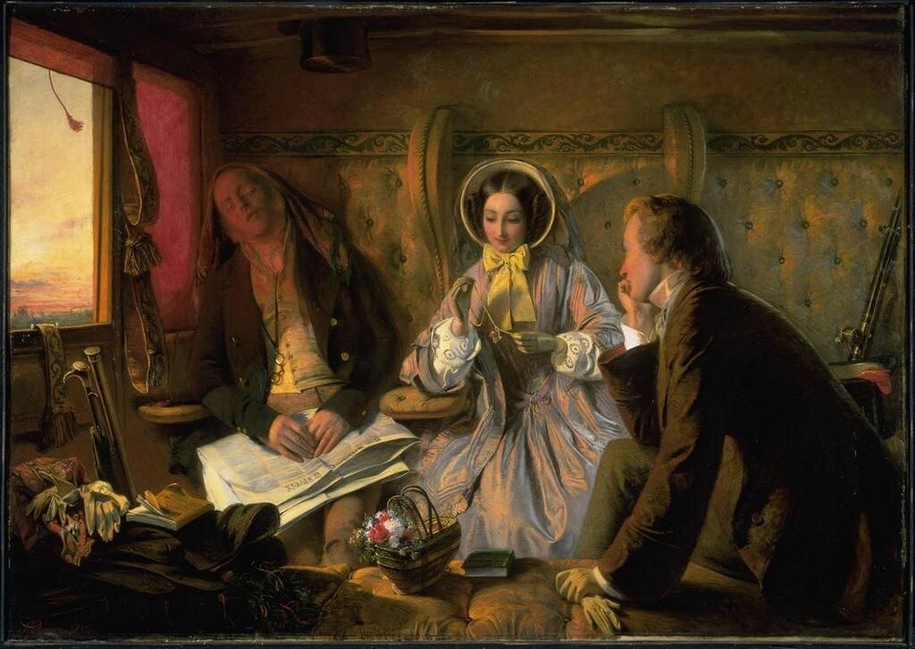
Many modern ideals surrounding love and marriage today have their roots in the Victorian era. By the beginning of the 19th century, marriages for economic and social purposes were falling out of popularity. Instead, the evolution of the family unit led to a heightened societal value for marriages based on mutual affection, emotional satisfaction, and love.[i] Called the “companionate marriage”, this ideal shaped the way that people met and courted in the 19th century. The ideal of marriages based on love gave young people, especially women, a new level of agency in their choice of partners.

The concept of ‘love at first sight’ originated in the Victorian era, along with the ideal of the companionate marriage. Painting by Abraham Solomon, “First Class: The Meeting… and at First Meeting Loved,” oil on canvas, 1854. Part of the collection…

The concept of ‘love at first sight’ originated in the Victorian era, along with the ideal of the companionate marriage. Painting by Abraham Solomon, “First Class: The Meeting… and at First Meeting Loved,” oil on canvas, 1854. Part of the collection of the National Gallery of Canada: https://www.gallery.ca/collection/artwork/first-class-the-meeting-and-at-first-meeting-loved

The widespread ideal of the companionate marriage had consequences beyond heterosexual marriages, as well. Sharon Marcus asserts that the newly held belief that it was better to not marry at all than to marry without love made space for people to choose to remain unwed. Further, the evolution of marriage laws allowed a certain amount of flexibility that allowed female couples living together to use the language of marriage to describe their relationships as well.[ii]

Because of the rise in popularity of the companionate marriage, young people had more independence in their choice of partners than previous generations. However, with the parents no longer being the primary facilitators of romantic relationships, the ways that couples found each other also changed. While some couples still met through their parents or other family members, people also met through mutual friends or because they were neighbours. In addition, many people met through work or social events like picnics and church-related activities.[iii]

Another (less common) way of finding a partner was through matrimonial advertisements. Published in periodicals, matrimonial advertising began mostly in working-class communities, but spread to the upper classes by the 1870s. In the article “Victorian Girls Gone Wild: Matrimonial Advertising and the Transformation of Courtship in the Popular Press,” Jennifer Phegley argues that matrimonial advertisements provided new opportunities for lonely singles to find each other and increased women’s agency in courtship. While these advertisements could provide people with a way to find a compatible partner without relying on making connections through their existing social circles, they came with a certain amount of social stigma. These ads challenged traditional gender roles of masculinity and femininity, as women were upfront about their wants and needs in their searches for husbands. Women who posted advertisements were often considered immodest.[iv] However, these “immodest” practices were ultimately a precursor to women’s positions as more equal partners in courtship by the beginning of the 20th century.

It could be said that matrimonial advertisements were the dating apps of the Victorian era.

It could be said that matrimonial advertisements were the dating apps of the Victorian era.

            No matter how they initially met, courtships were usually short, and couples were often engaged within nine months, oftentimes less.[v] During the time of courtship, couples found several ways to spend time together and grow their ties to each other. In the public sphere, they would go on long walks and attend community social events together. Most courtship happened in the private realm, however, as men would call on women at home and have tea or supper with her and her family. Despite this, parents often allowed couples a certain amount of privacy together in the home after these meals. At times, this led to “complications”, but the practice was nonetheless fairly universal.[vi]

Though courtships were short, engagements were commonly much longer, and usually lasted several years. This was especially the case for working-class couples, as they had to work to save money for the marriage. During the engagement, couples exchanged gifts. Though the gifts varied widely depending on class and status, three types gifts were fairly universal. People commonly exchanged engagement rings. They also often traded pictures of each other or had their photograph taken together. Lastly, couples often exchanged locks of hair. This was a gift that “involved no expense and was a sure sign of intimacy.”[vii] More often than gifts, however, couples wrote each other letters. As they were sometimes separated for long periods of time during their engagements because of work and familial obligations, letters were the main source of communication. Many relationships developed in a large part through the written word.

These items from the Dalnavert Museum collection represent some common gifts that lovers would exchange. Locks of hair could be kept in jewellery like this brooch.

These items from the Dalnavert Museum collection represent some common gifts that lovers would exchange. Locks of hair could be kept in jewellery like this brooch.

Though many things have changed and evolved since then, the Victorians’ value for love-based marriages shaped our own cultural understanding and experiences of romantic relationships today. So, if you’re stuck on what to do this Valentine’s Day, take a page out of the Victorian’s books – go for a long walk, send a letter or cute picture, give your lover a lock of your hair, or take out an ad in the local newspaper describing your ideal partner.

Happy Valentine’s Day!

[i] Jennifer Phegley, Courtship and Marriage in Victorian England, Santa Barbara, California: Praeger, 2012.

[ii] Sharon Marcus, Between Women: Friendship, Desire, and Marriage in Victorian England, Princeton: Princeton University Press, 2007, 211-212.

[iii] Ginger S. Frost, Promises Broken: Courtship, Class, and Gender in Victorian England, Charlottesville And London: The University Press of Virginia, 1995, 58.

[iv] Jennifer Phegley, "Victorian Girls Gone Wild: Matrimonial Advertising and the Transformation of the Popular Press," Victorian Review 39, no. 2 (2013): 132.

[v] Frost, Promises Broken, 61.

[vi] Frost, Promises Broken, 63.

[vii] Frost, Promises Broken, 64.


Bibliography

Frost, Ginger S. Promises Broken: Courtship, Class, and Gender in Victorian England. Charlottesville And London: The University Press of Virginia, 1995.

Marcus, Sharon. Between Women: Friendship, Desire, and Marriage in Victorian England. Princeton: Princeton University Press, 2007.

Matthews, Christopher. "Love at First Site: The Velocity of Victorian Heterosexuality." Victorian Studies 46, no. 3 (2004): 425-54. https://doi.org/muse.jhu.edu/article/173476.

Phegley, Jennifer. Courtship and Marriage in Victorian England. Santa Barbara, California: Praeger, 2012.

Phegley, Jennifer. "Victorian Girls Gone Wild: Matrimonial Advertising and the Transformation of the Popular Press." Victorian Review 39, no. 2 (2013): 129-146. https://doi.org/10.1353/vcr.2013.0060.

Dalnavert Staff Lockdown List PART II

How has the Dalnavert staff been passing time in lockdown? Below you’ll find MORE of the music, podcasts, books, TV shows, and video games that are keeping us entertained this month.

PODCASTS

Historical Friction: Hosted by Alice Procter, Historical Friction is a podcast about storytelling, pop culture, the past, and why we reenact it.

Storytelling / Story-listening: Hosted by Jessica Hum, this podcast explores multiple Indigenous and cultural epistemologies, documenting oral stories and teachings as a method of preparation for climate change.

Ologies: Science correspondent Alie Ward interviews professional “-ologists” who specialize in topics including astrobiology (space biology), scorpiology (scorpions), ludology (games), and everything in between. Start with the episode on museums (museology) here.

Brainwashed: This CBC podcast explores the Canadian links to the CIA's covert experiments in mind control in the 1960s via the MKULTRA program. The Allan Memorial Institute in Montreal serves as the backdrop of this frightening tale of psychiatry gone wrong. Whilst detailing the terrible toll these experiments had on patients and their families, the narrative also explores the ethical shortcomings of intelligence agencies and governments since WWII, spanning the Cold War to the War on Terror, in the baffling race to control minds.

TV shows (for kids) 

Clifford The Big Red Dog (from 2001): Clifford is a great show to watch if you have small children at home, and you’ll appreciate the great voice acting and fun that is this show from 20 years ago. John Ritter, Cree Summer, Kel Mitchell are super fun to listen to.

Kiri and Lou (CBC Gem): This cute and short show from New Zealand is soft on the eyes (muted colours and claymation) so it is perfect for littles. There is always a very fun song in each episode and the comedy is fun to enjoy for adults and kids. Plus for those who loved New Zealand’s Flight of The Conchords, the character Lou is voiced by Jemaine Clement.

TV Shows (for grown-ups)

Bridgerton (Netflix): Bridgerton is a classic bodice-ripper romance made for modern audiences (think Jane Austen meets Gossip Girl). The lavish, bright Regency-era set and costumes alone make this series worth the watch. Honourable mention also goes to the soundtrack of pop songs performed by a string quartet.

Burden of Truth (CBC Gem): a suspenseful legal drama series that is not only filmed in Manitoba, but set here too!

MUSIC

Medieval Bardcore: the musical genre sweeping the internet. Bardcore, also known as ‘Tavernwave’, is like if you took your favourite 21st century pop hit  and threw in a harpsichord and your grandma’s church choir. Stream-eth renowned bardcore composer ‘Hildegard von Blingin’ on ye olde tube of you here.

Sea Shanties: Historically, sea shanties were labour songs, sung by working men on ships in the 19th century. The genre is currently going through a cultural resurgence, and it's no wonder. Themes of hardship, isolation, and longing, combined with generally upbeat melodies, make these classic songs the perfect soundtrack to an extended lockdown. We recommend starting with Great Big Sea, The Pirates Charles, and The Dreadnaughts.

Ys - Joanna Newson: Want to feel like a peasant frolicking gayly in a field of flowers in the 1500’s? Classical harpist, singer, and married to Andy Samberg, Joanna Newsom is the musical genius you’ve never heard of <3

Merry Christmas Lil' Mama: This is the 2020 version of a Christmas mixtape first released by Chance the Rapper and Jeremih in 2016 via Soundcloud. It's an inventive, joyful collection of songs that celebrates family, friendship and Christmas. It's also a mix bag of styles (from gospel to trap) which doesn't always work but never loses its spirit of fun.

Fantasy Baseball at the End of the World - John K. Sampson: Local musician Sampson (headman of The Weakerthans) released this single back in July, but its sentiment still rings true. It is a highly relatable ballad about the emotional rollercoaster that is living through a simultaneous public health crisis and political upheaval. It ends with some optimistic advice we can all take these days - I’m going outside / and gonna help organize / something better, something beautiful.

Video Games

A Short Hike (Nintendo Switch): Created by the Canadian developer Adam Robinson-Yu, this peaceful little game centres around a young bird called Claire who explores Hawk Peak Provincial Park. As you hike, swim and fly across the beautiful terrains you encounter other small animals enjoying their lives. There are enough puzzles and games to keep it interesting, but the real joy is in taking your time to ramble and explore. This is about as anxiety free as a game can get.

Books 

The Picture of Dorian Gray by Oscar Wilde: A Victorian classic that proves that the ultimate dedication to youthfulness isn’t plastic surgery or an expensive skincare routine, it’s selling your soul! Through the gothic novel, Wilde exposes society’s inherent obsession with youthfulness and beauty, and its willingness to overlook depravity for a pretty face.

Cold Comfort Farm by Stella Gibbons: Written in 1932 this is a parody of all your favourite romance / rural British life novels and it is hilarious! There is a movie from 1995, and it is no. 57 on The Guardian’s 100 best novels and is on top of many lists for comedy novels. Reading this after Wuthering Heights and it has lent much depth and context to the comedy.

Inward Journey: The Life of Lawren Harris by James King: This biography gives an incredibly detailed account of Lawren Harris’ life as a painter and prominent member of the Group of Seven. A must-read for any fan of Canadian art history!

Social Media Accounts 

@WpgDaylightTkr on Twitter: The Winnipeg Daylight Tracker provides updates on how much daylight we gain in Winnipeg each day - an optimistic reminder that spring is coming!

@blackcraftspeopleda on Instagram: The Black Craftspeople Digital Archive highlights the stories of Black craftspeople and the objects they created. Their Instagram page is a well-curated and informative snapshot of this archive.

@erenanaomi on TikTok: Elena Kanagy-Loux is a lace maker as well as a collections specialist at the Metropolitan Museum in New York. As you watch her make lace creations, she educates the audience on textile and fashion histories. It is both relaxing and fascinating watching her make lace, but also you learn something! 

Dalnavert Staff Lockdown List

How has the Dalnavert staff been passing time in lockdown? Below you’ll find the music, podcasts, books, and websites that are keeping us entertained. We hope you get some joy out of them as well!

Podcasts

Literature Out Loud: Listen to classic Victorian stories, accompanied by historical and cultural analysis by experts, with Dalnavert’s own Literature Out Loud podcast. Adults should check out the episodes on H.G. Wells’s The Time Machine, while kids can enjoy Alice’s Adventures in Wonderland by Lewis Carroll 

Museopunks: Suse Anderson interviews museum professionals and academics about the potential for progressive museum spaces.

ArtCurious: Hosted by Jennifer Dasal; fun introduction into art history.

Overdue: “Podcast about the books you’ve been meaning to read”.

Revisionist History: Hosted by Malcolm Gladwell; re-examining history.

Stuff You Missed in History Class: We recommend the old episodes, particularly the ones on The Bloody Benders or H.H. Holmes if you’re into old-timey true crime.

Books (Fiction)

The Law and the Lady by Wilkie Collins: Thought of as the “first full-length novel with a woman detective as its heroine,” The Law and the Lady follows Valeria Woodville as she tries to prove her husband’s innocence. Valeria’s “quest draws her into a maze of false clues and deceptive identities, in which the exploration of the tangled workings of the mind becomes linked to an investigation into the masquerades of femininity.”

People of the Book by Geraldine Brooks: “The story focuses on imagined events surrounding the protagonist and real historical past of the still extant Sarajevo Haggadah, one of the oldest surviving Jewish illuminated texts.”

Moon of the Crusted Snow by Waubgeshig Rice “A daring post-apocalyptic novel from a powerful rising literary voice. With winter looming, a small northern Anishinaabe community goes dark” (how topical).

Carson Crosses Canada by Linda Bailey and Kass Reich: This is a fun kids book in which Annie Magruder loads up her rattlebang car and sets off from her home in Tofino, BC with her dog Carson to visit her sister Elsie in Witless Bay, Newfoundland. Her journey across Canada is a nice introduction to the diverse geography and cultures of the country.

The Mercies by Kiran Millwood Hargrave: A historical fiction novel set in the 1600s on the tiny Arctic island of Vardø, in a fishing village where a storm has wiped away all the menfolk, leaving the women to rebuild their community. Their newfound strength is shaken, however, when the church’s suspicion of witchcraft begins to spread North. The stark seclusion of the setting, combined with the radical strength of the people who persevere despite this, offers a certain comfort as we head into our own cold months of isolation.

Coraline by Neil Gaiman: A darker look at an Alice’s Adventures in Wonderland type of story. For young adults, and young-at-heart adults.

Books (non-fiction)

Stolen City: Racial Capitalism and the Making of Winnipeg by Owen Toews: Stolen City offers an accessible but in-depth discussion of how settler colonialism and racial capitalism have shaped and reshaped the urban landscape of the City of Winnipeg over the past 150 years.

Prairie Fairies: A History of Queer Communities and People in Western Canada, 1930-1985 by Valerie J. Korinek: Focusing on several cities, including Winnipeg, Korinek examines the queer experience in rural and urban people in the prairies. Community, activism and the lived experience of queer people on the prairies challenges the normative perceptions of Winnipeg and prairie histories.

Black on Both Sides: A Racial History of Trans Identity by C. Riley Snorton: Focusing on the intersections of race and transness from the mid-19th century to present, Snorton outlines a thorough and often violent history of trans black people. As violence against black trans people continues and is sadly a near daily occurrence, Snorton’s book feels more important than ever.

The Whole Picture: The colonial story of the art in our museums & why we need to talk about it by Alice Procter: Known for her Uncomfortable Art Tours in London, Procter continues her quest to expose and acknowledge museum’s colonial histories. She encourages readers, and museum visitors, to question what is being told through museum collections, but also what is missing.

Rooster Town: The History of an Urban Métis Community, 1901–1961 by Adrian Werner, Evelyn J. Peters, and Matthew Stock: Rooster Town reconstructs the history of the Urban Métis settlement in Winnipeg, bringing light to the multiple instances of land dispossession that Métis faced during the evolution of the City of Winnipeg.

Songs and Ballads from Nova Scotia by Helen Creighton: Originally published in 1932, this is a collection of 150 folk songs from Nova Scotia which displays the rich heritage of the region, drawing as it does on Gaelic, English, German, Mi'kmaq, Acadian and African influences. The songs themselves are bawdy, bleak, funny and offensive. They include some unique versions of the Child ballads, and I enjoy it for the interpretations of Irish folk songs I grew up with. Having crossed an ocean and settled in the fisherman's cabins of Devil's Island, songs like The Cruel Mother become uncanny but no less enjoyable.

Websites

Dalnavert Museum Virtual Tour: Virtual Reality allows unprecedented access to our heritage house from the comfort of our visitors’ computers or mobile devices.

The Virtual Museum of Canada: Managed by the Canadian Museum of History, this website features digital exhibits from museums all over Canada. 

Window Swap: Stuck inside? Open a new window somewhere in the world - WindowSwap gives you the ability to look through others’ windows.

Send in the Clowns: A showcase of Canadian clowns (featuring one of Dalnavert’s own staff members!)

Social Media Accounts

@VictorianHumour on Twitter: jokes from 19th-c books and newspapers.

@BlackCountryMuseum on TikTok: an open-air museum in the English countryside that’s always on top of the trends.

@historycoolkids on Instagram: showcases archival photos, videos, and textual material, while giving well-researched and entertaining context in the captions.

Music

Deep Listening by Pauline Oliveros, Stewart Dempster and Panaiotis: The pandemic has resulted in me listening to fewer podcasts and more music. This album was recorded in 1988 in a cistern 14 feet underground in Washington where the acoustics are, well, cavernous and damp. It's a bit like listening to music from inside a whale. It's at times unsettling, but the experience encourages the listener to calibrate their ears and sharpen their attention. This might be my second wave soundtrack.

Stay safe and warm, Winnipeg!

Book a Tour